Telehealth App
As final challenge of the UX/UI Design course at Telerik Academy, our team worked on a fictional Telehealth application project, encompassing comprehensive UX and UI processes, from user research to visual design, resulting in a fully functional prototype and validated through user testing.
Imagine an app that brings healthcare right to your fingertips, enabling you to connect with medical professionals hassle-free, manage appointments seamlessly, and take charge of your health journey, all without leaving your home. That's the essence of TeleDoc - app designed to make healthcare accessible, convenient, and personalized.

The primary objective of the course was to guide us through each stage of the UX journey:
1. Research
2. Ideation
3. Wireframes
4. Design
5. Test
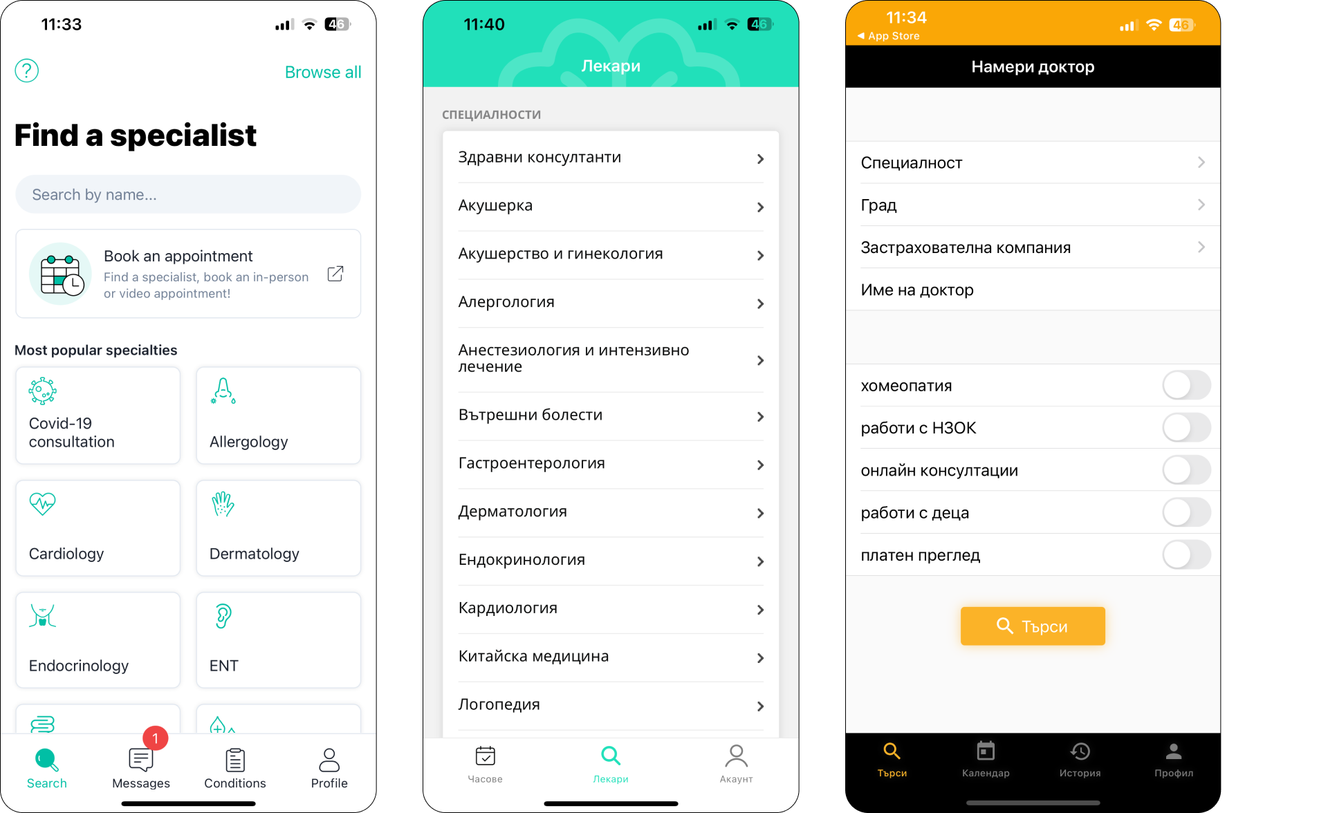
Our research encompassed a thorough analysis of both local and international healthcare app market, with a primary focus on platforms operating within Bulgaria. Specifically, we examined four key applications: EasyDoc, SuperDoc, and Healthyco. These apps predominantly functioned as databases for finding doctors.Our observations highlighted several shortcomings in these existing applications:
1. Limited Search Options: The search functionality lacked essential features such as filters and sorting mechanisms, hampering user convenience.
2. Absence of Document Storage: None of the apps provided a robust system for storing documents, medical history, or checkup records, which could significantly enhance user experience and convenience.
3. Location Filtering: With the exception of Superdoc, the apps lacked location-based filters for searches, restricting users' ability to find healthcare providers based on proximity.
4. The functionality on the Home Screens is limited
In summary, while these applications fulfilled basic needs, there was untapped potential for improved digitalization of the healthcare experience and a need for bolder features.

We strived for a sleek and modern aesthetic, using vivid colors to enhance the app's memorability and ease of use. For design inspiration, we explored UI8.com and similar platforms, streamlining our search to swiftly create an intuitive and visually appealing interface for our app.

The Home Screen was a tough challenge. We aimed for simplicity and put four buttons at the top for different consultation types (chat, video, clinic visits), plus a private ambulance option. A notification bell and appointment reminders were included too. To keep things handy, we added a news carousel for essential medical updates. Our goal was to make it easy to use with all the important stuff at a glance.

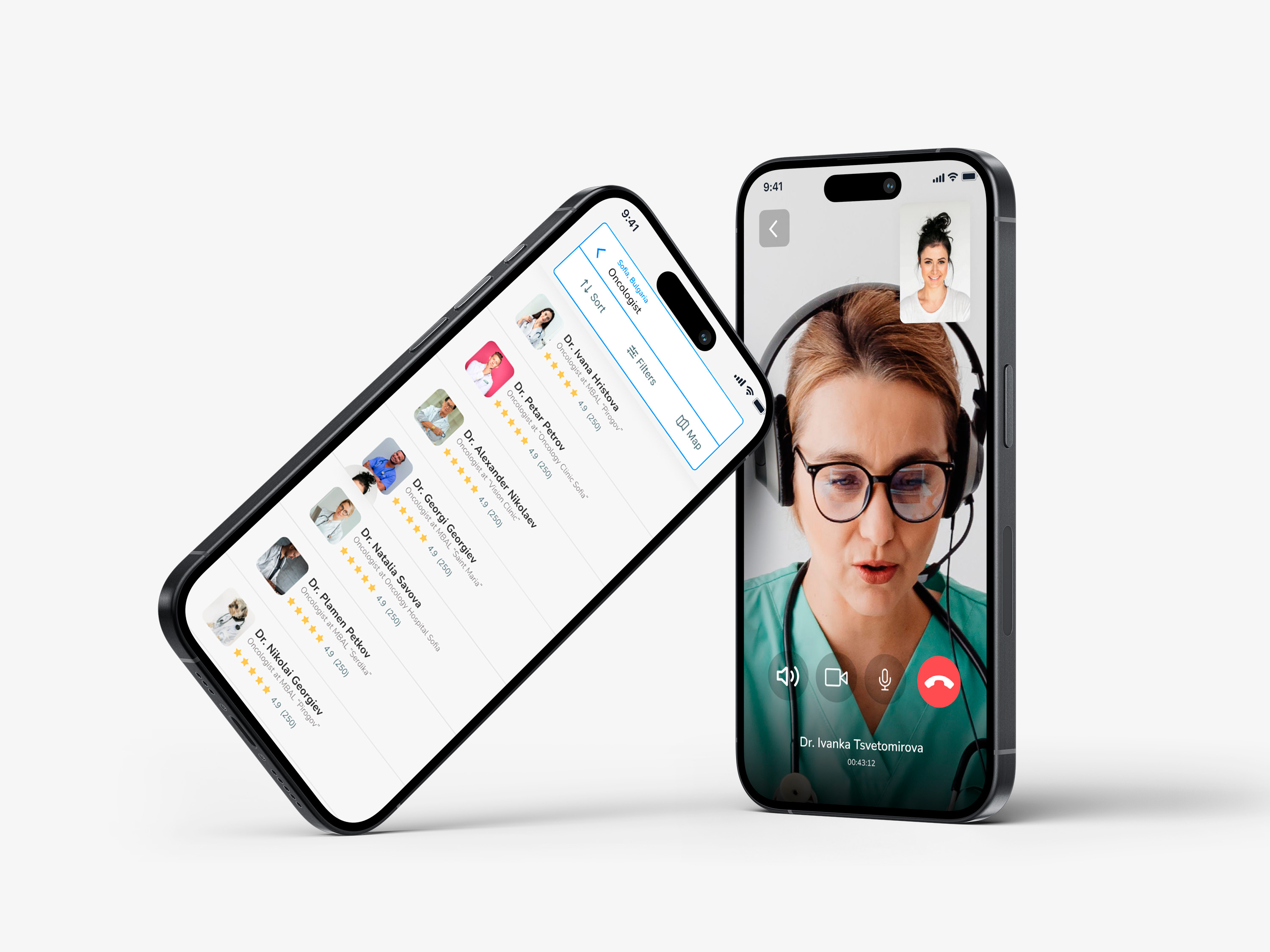
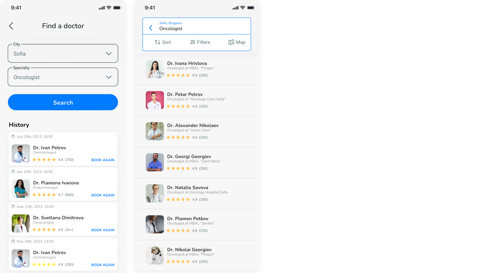
Designing the search screens presented a challenge as we aimed to enhance the doctor-finding journey. We focused on empowering users with numerous filtering and sorting options, even integrating a map to display nearby doctors. Initially, we incorporated a starting screen allowing users to input essential details (like location and doctor specialty) and included quick-access cards for their recent appointments. The subsequent screen displayed the search results alongside comprehensive filtering, sorting, and map functionalities.
Creating the doctor profile screens posed the challenge of displaying crucial information for quick user decisions. Prioritizing the doctor's photo and rating facilitated quicker decisions. The screen was divided into two tabs - "Booking" and "About." The "Booking" tab offered the three consultation types and the doctor's calendar for easy appointment booking. Meanwhile, the "About" tab included a concise bio, years of experience, institution certification, and customer reviews.

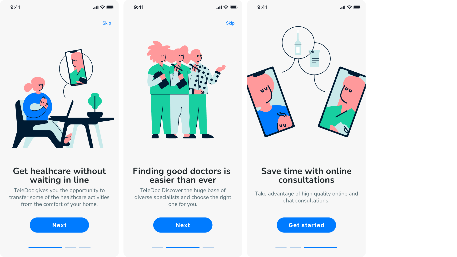
We also designed a suite of fundamental screens like onboarding, user profile, video call, chat, my booking and others.


The project served as a great learning experience, providing extensive knowledge in UX/UI design, visual aesthetics, and the development of digital applications.